Phone profiles
A profile a site reads as a phone
- 22
- handsets in the phone pool, each one taken whole
- 360 × 780
- screen the SM-S911B hands the page, and the window is that size
- 5
- touch points, the number Chrome on Android reports
- 153.0.7978.0
- ARMANOS Browser version the profile launches with
What a phone profile is, and what it is not
A phone profile is an ordinary ARMANOS profile whose fingerprint template is Android · Chrome (phone). Everything else about it works the same way as any other profile: its own cookie jar, its own storage, its own proxy, its own window, its own scenario and schedule. What changes is the device it describes and the way its window behaves.
It is not an emulator. Nothing here boots Android or runs an application package. The browser that renders the pages is the same desktop build, ARMANOS Browser 153.0.7978.0, and it is handed a seed that says this machine is an SM-S911B. The window is then resized to that handset's screen, touch emulation is turned on, and the pointer is declared coarse with no hover.
It is also not a phone sitting in a rack somewhere. There is no modem, no SIM card, no sensors and no application store underneath it. Everything a page can learn through JavaScript and HTTP headers is a phone. Everything that needs the operating system to actually do something is the desktop machine you are sitting at.
Where the line runs
The handset comes whole, not in parts
On the desktop templates the generator is allowed to mix: real people do buy a machine with this GPU and that screen. A phone is not built that way. Screen, pixel density, GPU, cores, memory and vendor fonts are fixed by the model. A Pixel with a Samsung screen and a Xiaomi GPU is not a rare device, it is a tell.
So the phone template has exactly one pool, a pool of handsets: twenty two phones for Android · Chrome (phone), seven tablets for Android · Chrome (tablet). Each row is one real device, and the profile receives the row whole, including the ANGLE renderer string in the exact form Android reports it.
The handset is drawn from the profile id, so the same profile gets the same device on every launch and two profiles get two different ones. If you want a particular model, the fingerprint card lets you pick it, and the whole device moves with the choice: screen, pixel ratio, GPU, cores, memory, fonts and the model hint change together, because a Pixel 7 with the previous handset's screen would be a phone that does not exist.
The tablet template is deliberately not mobile. Chrome on an Android tablet reports mobile: false, sends a user agent without the word Mobile, and receives desktop layouts, so a tablet calling itself mobile would contradict itself in its very first header. It still gets five touch points, and its form factor is Tablet.
Screen and pixel ratio
360 × 780 at 3 for the SM-S911B, 1280 × 800 at 2 for the SM-X816B. The available height equals the screen height, because a phone has neither a menu bar nor a taskbar, and that zero is meant as a zero.
GPU pair
Vendor and renderer exactly as ANGLE reports them on Android, for example ANGLE (Qualcomm, Adreno (TM) 740, OpenGL ES 3.2).
Cores and memory
From the handset row, not from a separate list. Memory follows the browser's own rule: rounded down to a power of two and never above eight.
Model
Modern Chrome froze the model out of the user agent, which now says only Android 10; K. The real model lives in client hints and nowhere else.
Android version
Never older than the handset's own launch version. Generation 4 filters the platform version pool by it, because a 2023 phone reporting Android 11 is a device that never existed.
Vendor fonts
The Android core set plus the shell's own families, SamsungOne for a Samsung row, Google Sans for a Pixel, MiSans for a Xiaomi.
What the page actually sees
The seed reaches the engine on the command line and is applied inside it, before any page script runs. The values below are not written over the real ones by an extension after the fact, they are the answers the engine itself gives.
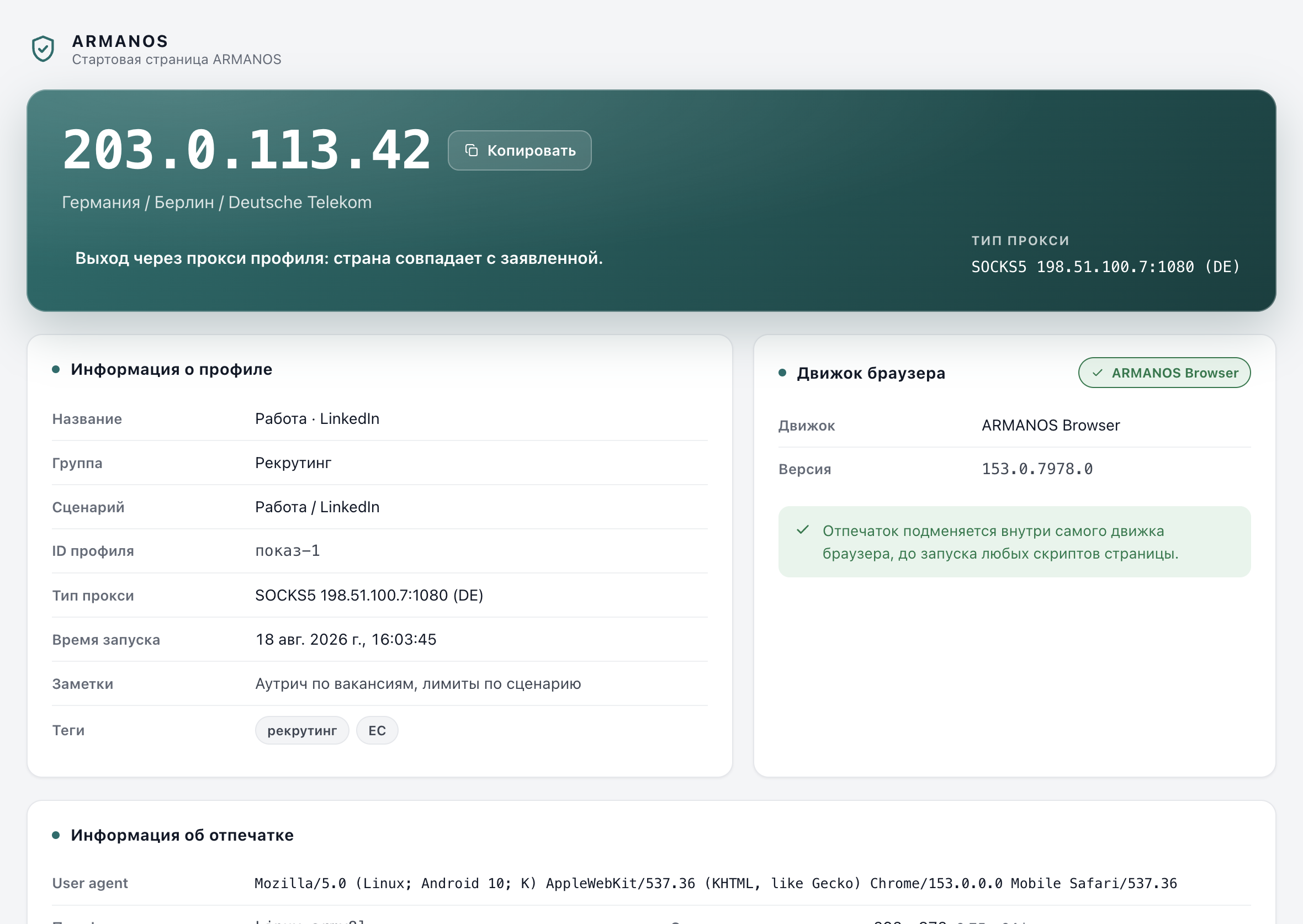
The user agent is the reduced Android form that modern Chrome really sends: the model frozen to the letter K and the system to ten. Writing Android 14; SM-S911B there would be the giveaway, because live Chrome stopped saying that years ago. The Chrome version inside it is the engine's own version, so the browser rendering the page and the string describing it agree.
The profile's own self-check reads these values back from the page and shows five extra rows that a desktop profile does not have at all: touch points, touch events, coarse pointer, window fits screen, screen orientation. That is the place where you see with your own eyes whether the profile is a phone right now, on this machine, rather than on paper.
- navigator.userAgent
- Mozilla/5.0 (Linux; Android 10; K) AppleWebKit/537.36 (KHTML, like Gecko) Chrome/153.0.0.0 Mobile Safari/537.36
- navigator.platform
- Linux armv8l
- screen.width × screen.height
- 360 × 780
- devicePixelRatio
- 3
- navigator.maxTouchPoints
- 5
- userAgentData.platform
- Android
- userAgentData.model
- SM-S911B
- userAgentData.mobile
- true
- userAgentData.formFactors
- ["Mobile"]
- userAgentData.architecture
- arm
- navigator.hardwareConcurrency
- 8
- navigator.deviceMemory
- 8
- WebGL renderer
- ANGLE (Qualcomm, Adreno (TM) 740, OpenGL ES 3.2)
One profile on the Android · Chrome (phone) template, launched on ARMANOS Browser. The handset is drawn from the profile id, so a different profile gets a different row from the same pool of 22.

Where the window size comes from
The seed says the screen is 360 points wide. The window is a desktop window, and desktop Chromium will not open one that narrow: ask for 360 and you get 500. That was measured on the built engine, not read in documentation. A window wider than the screen it claims is a device that exists nowhere, and the check takes one line: innerWidth greater than screen.width.
So the window is brought to the handset size the same way the engine's own device mode does it, over the debugging protocol. The remembered window position is restored for a mobile profile, the remembered size is not: stretch the window with the mouse once, and the profile would carry a handset whose window is wider than its own screen.
Two more things the seed cannot carry. Measured on this engine: without the launch flags, ontouchstart in window was false while maxTouchPoints said five, and the coarse pointer and no hover queries disagreed, so the phone had a mouse. Two flags close exactly that, and with them all three answers come back true.
New pages are held before they run. A new tab, and a frame from another origin living in its own process, where advertising checks and bot checks usually sit, each get dressed before the first line of their script. Without that, the outside said 360 × 780 while the inside said the whole desktop.
Window size
A launch key for the first window, then a device metrics override over the protocol for every page, including new tabs and cross-origin frames.
Touch
The touch events launch key, plus the five touch points that come from the seed.
Coarse pointer, no hover
Blink settings that name the finger and the absence of a mouse: primary and available pointer types coarse, hover types none.
Screen orientation
Derived from the dimensions rather than set separately. A device reporting 360 × 780 and landscape at the same time argues with itself in one line.
Mouse becomes touch
The engine turns mouse input into touches, and automation on a mobile profile dispatches touch events, because a live handset sends no mouse events at all.
If the outfit does not land, you are told
How to create one
It is one field in the profile form. Nothing else about the profile changes shape: scenario, proxy, extensions, groups, schedules and automation work exactly as they do on a desktop profile.
The picker carries an honest note under it, in the place where you decide rather than in documentation. This computer does not have the phone's own fonts, Roboto and Noto, and a site that measures fonts will notice. On ARMANOS Browser the note adds a second line, because that profile also shows a few fonts of this machine: without them pages would come out blank.
One restriction applies to older profiles. The phone template needs the third generation of the fingerprint generator or newer, and profiles created under the first two generations are not offered it. Their frozen generator does not know the template, and a silently substituted template would be worse than a refusal: the card would say phone while the sites received a Mac.
- 1
New profile, then the fingerprint template
Choose Android · Chrome (phone), or Android · Chrome (tablet) if you want the tablet, which is 1280 × 800 on most rows.
- 2
Read the note under the picker
It states what this machine cannot do for a phone profile, and it says different things about the two engines, because the truth is different.
- 3
Attach a proxy as usual
The template describes the device, not the route. A phone profile without a proxy leaves from your own address like any other profile.
- 4
Optionally pick the handset
Open the fingerprint card and choose a model. Screen, pixel ratio, GPU, cores, memory and fonts come with it, and saving the card does not wipe the choice.
- 5
Launch
The start page opens first, the window is brought to the handset size, and the destination opens after that.
The connection fields, and why a desktop profile has none
The connection object is read early by the sites that care about it. A phone whose network numbers match a laptop is an environment disagreeing with itself, and that mismatch is easier to notice than any single value inside it.
The numbers come from the same seed as the rest of the profile, and they follow the browser's own rules rather than what sounds plausible. The engine rounds latency to a multiple of 50 ms and caps it at three seconds, caps throughput at 10 Mbps and rounds it to 50 kbps, and multiplies both by a factor derived from the host name, which is why one real machine shows slightly different numbers to different sites. Values real Chrome never emits, 15 or 20 Mbps for instance, are checked in one line and give away a substitution more surely than no substitution at all.
The effective type is not drawn, it is derived. The engine does not store it either: it computes it from latency against thresholds taken from the source, 2010, 1420 and 272 ms. Drawing it separately would produce a 4g connection at 300 ms of latency, a pair real Chrome never reports.
Android also exposes three fields the desktop does not have at all: type, downlinkMax and the type change handler. A phone profile gets them, a desktop profile does not, and that is precision rather than caution: adding them to a desktop profile would create a tell where none existed. On ARMANOS Browser they are opened by a launch key given only to phone profiles, and only when the build declares it can substitute their values, because the key on its own would expose the host machine's own numbers, and a phone with unlimited bandwidth gives itself away as surely as a phone with no fields.
downlink
Phone: 1.5 to 8 Mbps. Desktop: 5 to 10. Identical numbers on both would be the mismatch itself.
rtt
Phone: 100 to 300 ms. Desktop: 50 to 200.
effectiveType
Derived from latency by the engine's own thresholds: 3g from 272 ms upward, 4g below it.
type
cellular or wifi, on a phone profile only. A phone on Wi-Fi is ordinary, so it is not treated as a rarity. Empty on a desktop profile, where real Chrome has no such field.
downlinkMax
From the constant table in the engine source: LTE 100, HSPAP 42, Wi-Fi 11, 54 or 600. Never below downlink, since a channel cannot deliver more than its own ceiling, and always matching the connection subtype, because 3g with an LTE ceiling does not happen.
When a phone profile is the right choice
Use it where the site itself behaves differently for a phone: a different layout, a different set of features, a different flow through the same account. Social platforms and marketplaces routinely serve a phone pages they do not serve a desktop, and reading those pages from a desktop profile means reading a different product.
Use it where the account's history is a phone's history. A profile that has always been a phone and stays one is consistent with itself. A profile that was a Mac last week and a Samsung today has changed machine underneath a live login, which is a bigger event for a site than any single value in the fingerprint.
Do not use it where the work needs the device itself. An installation from an application store, a push notification, a confirmation code by SMS, a camera, a fingerprint reader, a sensor reading: none of these are browser questions, and a phone profile has no answer for them.
And do not reach for it only to make a desktop workflow look mobile. A 360 point window is a cramped place to work in, the mobile web version of a site is often the poorer one, and a desktop profile that is honestly a desktop is a better identity than a phone that cannot back itself up.
| What you need | Phone profile | Desktop profile | A real phone |
|---|---|---|---|
| Mobile layout and mobile client hints | Yes | No | Yes |
| Touch events and a coarse pointer | Yes | No | Yes |
| The handset model in client hints | Yes | No, the field is empty | Yes |
| A window the size of the handset screen | Yes | No | Yes |
| An application installed from a store | No | No | Yes |
| Camera, microphone and sensors of the handset | No | No | Yes |
| A confirmation code by SMS on the device | No | No | Yes |
| Dozens of identities side by side on one machine | Yes | Yes | No |
The honest gap
A real device has hardware. Nothing on this page adds hardware. The engine can hide a device from a list, it cannot take the camera off your machine or put a phone camera on it, and a profile claiming zero cameras on a machine that has one would answer no cameras to the device list and then hand one over on the first capture request, which is louder than any number.
That is why device counts are stated and capture is not. A phone profile reports the number of cameras and microphones an Android device reports, and if a page asks for an actual stream, what arrives comes from the machine you are sitting at, or nothing arrives at all.
Fonts are the second honest gap, and the app names it at the moment you choose the template rather than hiding it in a manual. Your computer has no Roboto and no Noto. Measuring fonts is a routine check, and it can see that. On ARMANOS Browser the profile additionally carries a few of this machine's fonts, because a browser with no fonts at all renders empty pages, and that is a worse outcome than a partial disguise.
A cloud phone service rents you a real handset with a real modem and a real store, and the trade is that you work through a video stream on somebody else's device, one session at a time. A phone profile trades the other way: no hardware, but a real browser on your own machine, many of them side by side, with your own proxies, your own cookies and your own files.
No camera or microphone of a phone
The counts are stated, the capture is not. A stream comes from the host machine or does not come at all.
No sensors
No accelerometer, no gyroscope, no ambient light. A desktop machine produces no such readings, and there is no patch inventing them.
No SMS and no phone number
A code sent to a handset does not arrive in a browser profile, on any template.
No application store and no native applications
This is a browser. Anything that has to be installed on a phone stays outside it.
No phone fonts on your computer
Roboto and Noto are not there, and the app says so under the template picker before you create the profile.
What this does not do
- It does not turn your computer into a phone. No handset camera or microphone, no sensors, no SMS, no application store: a site asking for those gets the host machine's answer, or nothing.
- It does not carry the phone's own fonts. This computer has no Roboto and no Noto, the app says so under the template picker, and a site that measures fonts can see it.
- It does not give the profile a mobile network address. The route is the proxy you attach, and the template changes the device, not the exit.
- It does not decide how a site will treat the profile. It states what a phone states, and the judgement stays with the site.
- The three Android-only connection fields need a build that declares it can substitute their values. On an older build the profile does not get them, and the launch key is not passed.
Check it in the code
- The phone and tablet templates carry a whole handset, and screen, pixel ratio, GPU, cores, memory and fonts move together
- packages/shared/src/index.js · apps/desktop/test/mobile-really-mobile.js
- The window is brought to the handset size, with touch, coarse pointer and orientation, on both engines
- apps/desktop/src/lib/mobileEmulation.js · apps/desktop/src/lib/mobileWindow.js · apps/desktop/test/mobile-window.js
- The seed reaches the engine on the command line, and the mobile launch keys are given only to a mobile profile
- apps/desktop/src/lib/forkEngine.js · apps/desktop/test/mobile-window.js
- The Android-only connection fields go to phone profiles only, and only to a build that declares it can substitute their values
- packages/shared/src/index.js · apps/desktop/test/поля-связи-телефона.js
- The profile's self-check reads the phone values back from the page, and two real browsers are opened and questioned by the page itself
- apps/desktop/src/lib/fpAudit.js · apps/desktop/test/mobile-selftest.js · apps/desktop/test/телефон-живьём.js
Read next
How the fingerprint is built
The seed the phone template fills in, and where it is applied.
ARMANOS Browser
The build that renders the pages and receives the seed.
Profiles
Isolation, storage and proxy, identical for a phone profile.
What ARMANOS does not do
The honest limits of the whole product in one place.
Check it on your own machine
Create one profile on the phone template, open the start page and read what it hands the page. It takes a minute, and everything on this page can be verified there.